Monday, May 3, 2010
Droga 5- Puma L.I.F.T
Innovative. Creative. Captivating. Loved this ad! Appealing to all audiences. The graphics used and the background music went beautifully. The graphics of the flowers being in the sky and the man kneeling down to give her flowers was executed so well. This entire advertisement had the "wow" factor.
Mother- Neurofen
Creative. I had to watch it again to get the full effect, but I liked this add. It was very creative and showed how it works in a captivating way. It kept your attention all the way through while demonstrating it in a simple way. I like how they put the "problem" bird in black with a white background. They used a crow looking bird. Crows are a bird most people find as pest. It's simple voice over is straight to the point. I like the animation of how it lasers the problem to make it all better. Great animations and sounds. The knocking is an annoying sound that many people feel when they have a headache. Simple and to the point. Great advertisement.
Wongdoody- CA department of health
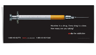
Cringe. I hate needles, love this advertisement. No need for words. This picture is excellent. Although not necessary, the copy is perfect. Everyone knows smoking is bad but people often don't consider it a drug. Reality is nicotine is a drug. The number 1-800-no butts is funny. It is to the point that there is no excuses for smoking while giving motivation. It gives motivation by reminding the target audience that there really is no excuse for smoking. It hits the audience in a very true, dynamic way. The cigarette portrayed as a needle was done beautifully. It has every last detail even down the the lines of the dosage on the cigarette. It makes the target audience think about their actions. Very powerful and well done.
La Communidad: Volkswagen
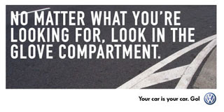

Real. I like this campaign. It is very relatable to the customer. I picked these two because they are very true about my life. I keep everything in my glovebox and am always scrambling to find things in there. A lot of my friends love their car more than they love anything. Especially boys, I have learned do not let anyone drive their cars. In high school if one of our friends drove a guys car it was a huge deal. Its the simple, little things that make this campaign great. It does not advertise the cars or the obnoxious labels of car, but instead focuses on the little truths of life. When looking at this campaign I could not help by laugh because it is so true. I think it missed the mark of selling its brand name, but was definitely creative. The simple white text on pavement, kept it short and sweet. There were no distractions. Just simple copy made to make you smile to yourself.
David&Goliath- Kia Soul
Loved it! Very creative. Although it used the cliche of using animals, it was very creative. I like how the use of the wheels. The part where the mouse was on the train tracks going no where but there was a train coming was funny and left you with the question of "what is coming next?" The copy of a new way to roll worked amazing with this advertisement. The used a very creative idea and made the advertisement really cute while advertising the features of the car. It showed the use of the mp3 and the sleek look of the car while keeping the audience engaged. I like the upbeat music. The lyrics of the song went really well with the movement of the car. The end where it advertised the features and price was short, sweet, and to the point. Great creative idea and got the point across clearly. Very well done.
22squared- Margarita Mayem

Love it. Great depiction of a margarita. Margarita as a devil? Evil depiction or accurate? The debate will never be settled. Some love them, some hate them. We've all heard the stories of tequila and no matter what people agree margarita's will have some sort of effect on you. The devil depiction shows a playful side of alcohol. It shows the danger you could get in yet uses the bright colors to depict the fun, playful side. The colors make you want to have one. The vivid background adds to the actual picture. I like how they used the limes for the horns. Very creative way to market margaritas. Evil and fun turned into one great advertisement for alcohol. Different from other depictions and great way to market a tequila based drink.
Sunday, May 2, 2010
TAXI- Parkinson
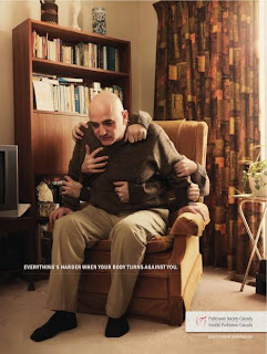
Well done. This advertisement is captivating. At first one may think to themselves, "where are all these hands coming from?" Then you read the copy "everything is harder when your body turns against you," and you begin to even wonder more. It's not until you read the Parkinson's logo until you get it. The hands are very powerful in the fact that they captivate the moment of how he is trying his hardest to get up and yet no matter how hard he tries there is always something holding him down. Many people don't stop and think about how hard it really is for people to live with parkinson's. I think this advertisement did a very good job and portraying the day to day hardships. This advertisement was only one part of a whole campaign. The campaign showed a variety of different people doing a variety of different day to day activities. Simple and to the point. Even though its a print advertisement it did a very good job at getting the message across.
Secret Weapon- Jack in the Box
Funny, cheesy, and unpredictable. Who would have thought to put Jack in the hot tub in a seductive advertisement? Creative. The two couples in the hot tub instantly give away that it is going to be seductively based. The voice of the women exaggerates the sexy undertone of this advertisement. I like how the woman asks Jack about trying new things. The visual makes you want to have a sanwhich. When you first see the ad come on you know its a Jack in the Box commercial because Jack but it takes you by surprise at how it is done. Funny and different for Jack in the Box. Well done.
Rethink- Playland

Interesting way to advertise for a theme park. Rethink is definitely a creative agency that thinks outside of the box. When you first look at it you wonder why you are looking at a heart. When you take a closer look at it you see that the string is separating your heart symbolizing the feeling you will feel on Playland's rides. This is a creative approach to this emotion and takes a few seconds to understand it. If I didn't know that Playland was an amusement park I would be very confused of what this advertisement is even for. The background color helps the pink color of the heart really pop out at you. I think its a very creative, innovative idea but to those who don't know about Playland would confuse them and then the advertisement would be completely ineffective. Great idea, don't know if it completely gets their point across.
Saturday, May 1, 2010
Ricahrds Group- Bridgestone
Terrible. They were trying to get viewers to tune into the Superbowl but completely missed the target. This was not an exhilarating thing to watch, quite frankly I could car less what happened to them. It not only did not keep my attention to intrigue me to tune in later but it left me with a feeling of "why? Did someone actually create that and think it would leave me with suspense?" The animation was clever. The use of the classic Mr. Potato head was a cute thought and the music started off intense but lost power. The "Sheeeeep" part was terrible. The tag line at the end did not leave me with a question to think about for more than .2 second. Did not like this ad. Thought it was completely ineffective. Started off well, ended terribly.
AMV BBDO- Act now
Great campaign. The music is absolutely perfect for this ad. I really like the part where the girl is getting out of a bathtub and is still leaving her footprint. The message is phenomenal. No matter how clean you are, you still leave some sort of footprint. And the part where the guy is sitting on the couch doing nothing. Even though he is not moving or doing anything, he is still leaving a footprint on the world. The dim lighting and angles add to the dramatization of the overall effect. AMV does a really good job at breaking stereotypes. I really liked how they used all different races and all different sized people all in separate settings and described all of them as being in their dream positions. The voice over is a child reflecting the innocence and evokes emotion from the audience. Very well done ad by AMV who does an excellent job at raising socially responsible behavior.
Cramer-Krasselt- Crocs
Smiles. This advertisement left me smiling. The technique of turning shoes into loving companions could not have been done better. The way they tenderly massaged her feet when she came home the way they ran to her with such force and love truly exemplified this love for her. It reminded me of my dogs who run up and greet me with such energy every time I come home as if I haven't seen them in ages. Or children who run to their moms after a long days a part. This advertisement definitely had a relationship based feeling toward it. The part where they tell the dog to be quiet and sneak around the door definitely gave them child-like qualities. The voice over at the end was perfect: short, sweet, and to the point. The slogan" feel loved" was a perfect way to end this advertisement. Very well done by Cramer- Krasselt.
Doner- Serta
Well done. This ad was very well put together. It showed serta's comfort of their mattress while using the cliche of counting sheep. In the voices of the sheep you can hear the tremble of sorrow. I really liked how they gave all the sheep different colored, vibrant eyes. The extra big tear that fell from the baby sheep's eye was an excellent addition. I like how the sheep had the pacifier at the end and spit it out. Excellent job done by Doner. Successfully advertised the comfort of the bed while using a funny cliche and making you feel connected all at the same time. Held audience's attention and made them feel for both the sheep and the woman. I really like how they made the family of sheep. The women had lipstick and bows and the kids were so innocently portrayed.
Wednesday, April 28, 2010
BBH- Sprite Slam Dunk
Simply Beautiful. The mix of two arts. Poetry and rapping while describing another talent, dunking. I like how they used a real person and depicted average people and did not use celebrity endorsements. It was real, simple, and beautiful. The words are exceptional and well crafted. The setting of starting off in the library added to the effect of scholarship. The black and white effect added to the dramatization of the basket ball court. You only see Sprite shown once in the very beginning. The juxtaposition of poetry and sports was done beautifully. Typically one would not put basketball and poetry together but this was very well executed and the audience was captivated the whole time. Simply beautiful.
3 coming together advertisement
This ad starts with parts of the car coming together. It is visually enticing and different from most other car commercials which usually depict cars driving fast. It shows different the parts of the car while using an excellent choice in background sounds. The music at the end is very exciting. The tag line "isn't it nice when things just work," was very creative and goes well with the advertisement. Very well done.
Great advertisement. In a time when the world was separated coke took advantage of this and used their product to bring everyone together showing that everyone had something in common. All the people come together to enjoy a classic product. Great advertisement with great filming and angles. Really showed different people from different countries really coming together.
Great ad that shows how a coke is made. Creative and innovative. Different from any other beverage commercial. Shows the creativity and graphics W+K is capable of. Loved the ad and the happy music in the background. Appealing to all ages.
Tuesday, April 27, 2010
Weiden & Kennedy- Dante's Inferno
"Hell awaits?" Inappropriate. This advertisement had excellent graphics and was a good idea, however the tag line at the end was completely not necessary. Even though it is rated as a mature game, children can still see the advertisements for it. The portrayal of the woman in the beginning is completely stereotypical. Her low cut top and seductive outfit is what gets the man. Then he of course chases her. The music was an excellent choice, it describes the situation perfectly. Well executed advertisement, however the tag line completely ruined it. The use of graphics will entice children's interest in watching it and may cause problems with their parents as they beg to have it. Well-done but inappropriate ending.
Dentsu 5- iPhone
This commercial was very easy to understand universally which I believe makes it a great advertisement. Even though it is done in Japanese, even without reading the subtitles I could understand the message. The music put you in a relaxed calm mood while keeping the audience's attention. Overall, very sweet advertisement that got its message across in a creative way. They focused on one application of the phone and did not try to go overboard with it. The night time setting definitely added to the dreamy atmosphere. The dog was a cute cliche added. When in doubt, use an animal to portray sweetness. A bit of a cliche, but cute. The shooting star was another cute cliche. Full of cliches but overall well done and universally understood.
Monday, April 26, 2010
3 unethical ads

Is this a joke? Terribly misleading. This diet is NOT a diet. Can easily mislead consumers who don't read the copy. Insults the consumer's intelligence by making them think they can lose weight on fast food. Sitting in the car makes you even lazier. This is a ridiculous advertisement.
Are you serious? DDB really is trying to make shock value out of 9/11? One of America's most tragic days and they are trying to make an advertisement out of it? This is one of the saddest most inappropriate ads. I am speechless. Having a bunch of planes flying towards the twin towers should never be produced. The dim lighting ads the effect of the sadness of this day. It is completely insensitive.

Advertising tobacco is now thankfully illegal. Something that kills 1200 people a day is socially irresponsible. Advertising that the taste is good entices people to want to smoke more which is just terrible all around. The cowboy is sexually enduring which only seduces woman to smoke more and men to aspire to be them.
3 Ethical Advertisements
Amazing advertisement. Definitely shows how advertisers have the ability to make models so unrealisitc. Shows society models are photoshopped to the extreme that they don't look like themselves. Demonstrates how we, normal people, should not feel so insecure about our appearances and not compare ourselves to unrealistic models. Great campaign that helps people feel better about themselves.
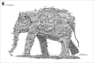
I like the tag line "our life at the cost of theirs." It shows how us humans are being selfish in the face we continue to build on wild life's homes. The shape of the elephant is very creative and clearly gets the point across. The black and white image adds to the dramatization of this advertisement. Great ad that gets people thinking.
Great campaign! I like how they challenge them to take a day off. When all 1200 people come together and collapse you can really see the impact tobacco has everyday on people and their families. This campaign was very impactful and definitely had people talking long after it was released.
Saturday, April 17, 2010
Cliff Freeman & Partners- Little Ceasers
Cliff Freeman & Partners recently shut their doors. Although they no longer exist, they did leave some memorable campaigns and work behind that will never be forgotten. Love them or hate them, they will forever be engrained in your head. "Pizza, Pizza" for Little Caesars is amongst some of these unforgettable slogans. This advertisement is stupid and funny. They tried bringing humor the the simple fact that they now deliver. It is so stupid at times, you can't help nut laugh. The use of the mechanical dog was funny. The expression on the employees face throughout the advertisement is so intense. When the boss squeezes his face it reinforces the idea that the boss is completely in control over their employees and kind of degrades them as being lesser of a person. The different settings they put them in is creative, I like the part where he is closing the car door with his foot. This show that they have every detail down to perfection and don't forget to practice anything. The use of different races at the time made the advertisement that much more appealing and widened their audience.
Wednesday, April 14, 2010
VitroRobertson- New Castle
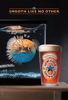
Creative. I like how they stepped out of the box of stereotypical beer advertisements. There is no one trying to look seductive and there is no party going on. This advertisement is simply advertising the best quality of the beer, the smoothness. I like how they used a blow fish, it was a very creative idea. No one would think to use a fish and beer in comparison to one another. The placement of the water and the bubbles was placed perfectly. On the "smooth" side the blow fish is breathing more freely as we can see the bubbles rising on that side. On the not smooth side the bubbles are just sitting on top of the water reflecting difficulty to breathe by the fish. The way the glass is cut also reflects the smooth side as being cleanly cut while the not smooth side is a bit more rigidly. The only thing I would of changed is I think they should have placed the treasure chest on the smooth side to symbolize smoothness is a treasure we must appreciate. Besides that, I really enjoy the thought of this advertisement and think they got the point across in a new, creative way.
Crispin Porter + Bogusky - Burger King
This advertisement caused a lot of controversy. Many associations affiliated with mentally handicapped people were outraged. The words, "insane, "crazy," and "mad," all imply the king being mentally handicapped. He is being chased by someone who is in an all-white coat which suggests a doctor uniform. They then continued to tackle him and help him gain control. This advertisement had good intentions and was funny until you realize the little details. Advertisers must think from all different angles. To some this advertisement was funny, to others it was offensive. Good idea, offensive portrayal.
Tuesday, April 13, 2010
McKinney- Nike
Beat the B.S.- STEREOTYPES to the maximum. The point in this advertisement is to break the stereotypes, inequalities, and stupidity that people still believe. I like the point in the advertisement but it is way too long. It very creatively crafted and the different images keep you wondering. Some of the things they say are kind of shocking. If a child saw this though it could put wrong ideas and maybe even put stereotypes in their heads that weren't there before which would have the opposite effect. They don't get to the point quick enough, it is like a tutorial. I would have turned off the advertisement before I saw that it was for Nike and was actually going against these stereotypes. Great idea, but did not keep the consumer intrigued.
Saturday, April 10, 2010
Team One- Boost Mobile
Hilarious and creative. I like the use of the older generation to exhibit something for young people. When I first saw this I had no idea what it was for, but then after it made so much more sense. I like her dancing at the end and showing the older people freak. The tag line "but its just more fun showing old people, phones just got fun," really captured the essence of the ad. I like how it completely got away from traditional advertising for phones and didn't show anything else about the fun except for the fact that its fun. The language and dance moves they were doing throughout was hilarious. Over-exaggerated the point but successfully did it. The use of language was perfect for the actress' part. Well done.
Euro RSCG- Nikon
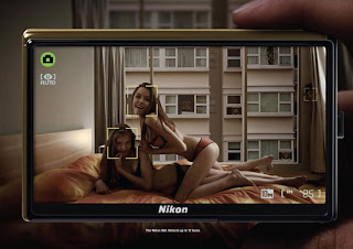
Provocative. This advertisement is very suggestive. When I first looked at it, I did not understand the point. Completely missed the point. After looking at it and analyzing it I saw the man in the background creeping. The auto-focus is the feature being advertised. The advertisement is very stereotypical, slightly inappropriate and creepy, and did not do a good job and prevailing the whole point. I did not like this ad and thought it was just slimy and inappropriate. Why is there girl and girl action with a guy creepily watching? If a kid saw this, what would they think? This advertisement took a while to understand and did not convey an explicit message.
Arnold Worldwide- Tyson
Priceless. We all know kids are the pickiest eaters. The answers are real, you can tell there is no script and no forced answers. I really liked this advertisement. It's honest, funny, and gets the point across. I didn't exactly like the end when the boy says "to be honest i don't really like... then cuts into introducing the product." I know what they were trying to get across but if you were just listening you may think that the kid doesn't like it at first until they continue with the dialogue. The white background they used as the kids were talking emphasized the innocence and purity. The mispronunciation of the words also showed the innocence of the children. I really liked the little boys face who without words expressed his exact feelings. To kids what something looks like is very important, it had nothing to do with the girl not liking spaghetti but rather the appearance. Its a good way to market chicken and healthy food to kids. I liked the diversity that they used. They used children of many different races making it universal. The end when they say "thanks mom" also markets to the mothers suggesting they should serve their kids Tyson's chicken. The line when the girl asks for more shows how much they really do like it.
Saturday, April 3, 2010
Kaplan Thaler Group- Trojan
I really thought this ad was creative. They wanted to raise awareness which they sure did from the controversy of it. They got a ton of media over it. The pigs were a very clever idea. No one wants to pick up a pig. It was a bit of a cliche with the beautiful women seeking to meet a man at the bar to go home with later. But the overall idea was very creative. The song went perfectly with the advertisement. No need for pigs to fly when you can just get a condom and no longer be a pig. The angles the used when the pig was walking toward the bathroom to get a condom was great, kind of cliche but got the point across. They used a women's thin legs as he was approaching the condom box. This agency has some very creative campaigns. They may have overused the pig a little bit considering there was not one "nice guy" until that one got the condom but I think that just engrained the idea even more. A little over exaggerated but overall great ad.
Fallon- Sony
Creative, amazing, innovative. Loved this commercial. The use of the bunnies transforming into other things was an awesome idea. How you go from lcd screen to play-do to advertise for it is brilliant. I especially liked the part where the whale turns into a bunny. The colors and use of colors was fantastic. At first when I viewed this advertisement I had no idea what it was about, but at the end it all made sense. The fan of waiving colors drove the message home. The different camera angles and scenery really exemplified the use of colors and all the different ways you can view a single object. Different than any other TV ad I have ever seen. Very innovative and different.
Leo Burnett- Amnesty International
This ad is powerful. It brings to the attention an issue that is so very real that so many people do not want to talk about. I like how they ended it with the innocence of a little girl. The footage that showed was so real and raw. It made you think twice about the ad and you couldn't help but feel sympathy for the victims of abuse. They showed many different issues but all dealing with human rights. The copy that went with it really helped push the point. This advertisement was informative and kept your attention the whole time. The facial expressions of the victims and their screeching screams and pleas for help are so hard to listen to. Its so real and so powerful. The background music helped add the dramatization of the advertisement.
Saatchi& Saatchi- Prius
Beautifully done. This animation based commercial incorporated everything it was hoping to. It showed the power of green and stated the lower emission as the car was driving through the town turning everything back to green. It had the great, simple tag line "its harmony between man, nature, and machine."It showed the interior of the car and the hills it could still climb. Creative and was not your typical car ad with some hot girl selling the product. Made on a need-base mind frame. Very practical advertisement that truly was just selling the product, nothing more nothing less.
Sunday, March 28, 2010
Publicis-Flemish Milk Board
This advertisement was sweet, funny and creative. I like how they set the commercial with the elder couple slow dancing. The kids dancing were hilarious. This advertisement can appeal to a lot of different audience groups. It can appeal to the parents to help persuade their kids. It also can appeal to the children because it gives them a one on one example. As I was growing up my mom always told me to drink my milk so I can grow up strong. This gives that message in a creative, cute way. Great choice in music and settings. I like how they decorated the rooms, it added to the message.
T.A.G/ 215
Monday, March 22, 2010
Campbell Mithun- United Way

Different and memorable. Good job at standing out. However, I don't know if everyone who walked past this understood the message. I like how they broke away from the typical stereotype of how advertisements usually portray poverty. They used an average woman who actually looks somewhat happy to be holding the signs. I think they needed another sign to explain the ads. Many people probably just walked by and didn't even give it a second glance. Good idea, but may have missed the point.
Sunday, March 21, 2010
Hill Holiday- Novartis
I enjoyed this video. It gets the point across. I think it could have been cut down.. it was kind of lengthy and towards the end was wondering what the point in the ad was. The use of the little girl represented innocence and really added the the affect. The smoke was a cool effect that exaggerated the idea. Many don't think that high blood pressure is a very serious problem and is kind of just normal, but we really do need to educate people about it as it is a serious health problem. I really like how they showed many different types of people in different settings it expressed the diversity and the fact it could happen to any adult.
Mullen- National Grid
Excellent campaign. Innocent, sweet, powerful. The background music fit the advertisement perfectly. The use of the little kid added extra effect. The scene where they jump in the pool/ the polar bears natural environment was heartwarming. The interactive aspect of the campaign adds a great strength to this advertisement. The one on one involvement makes it personal. It involves the audience and helps educate the public of how they can help. This campaign is global warming prevention and how to preserve energy. The day to day activities you can do to help the environment can be taught simply by becoming friends with Floe, the polar bear. This ad incorporates the consumer and the company while making a positive change in the community and on the bigger picture, the world. This is a great campaign that is executed beautifully.
Deutsch- Coors Light
Typical, typical, typical. Creative tag line? Yes. Humorous because it's funny and everyone has felt that way at one point. The song is funny and captures the mood of the wingman. The facial expression of the two at the table is priceless. She not only is only talking about herself, but looks like she could knock someone out. I like how they showed their beer in two different situations. One they suggest alcohol will give you the best time of your life and they completely used the cliche of the girl dancing out of control because of the beer. And I like how they showed the product also with the guy who is downing his sorrow with his beer. The dim lighting also sets the mood excellently. The man's face of complete and utter boredness and then he cheers' to his dacning friend is classic. "Taking one for the team, so your buddy can live the dream." Classic.
Monday, March 8, 2010
Carmichael Lynch- Harley Davidson
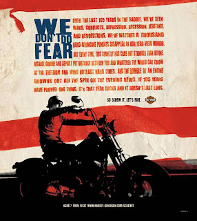
One of Carmichael Lynch's main clients is Harley Davidson. This advertisement reflects society at that point in time and appeals to Americans of that time. The copy is kind of lengthy but very appropriate. It leaves the audience with a feeling of empowerment and dominance, something lacking in many peoples lives. It gives a sense of control which many need in their lives. Harley Davidson is something that almost all American's recognize as being a classic. The use of the American flag in the background adds to the overall dynamic impression of this ad. The ending line "screw it, lets ride," is short, empowering, and strong. Great advertisement appealing to America's emotions and times of distress. Very well done.
Lowe Worldwide- Axe Effect

So typical. Axe has always been a provocative company advertising women's bodies more than the product. It shows the unrealistic results of what would happen if someone used axe. The visual of the woman cooking in that outfit is outrageous. It is very stereotypical in the sense that woman should be cooking and fantasy based on what she is wearing. Why is she on her knees? This is very suggestive of something else that is absolutely not appropriate. What if a kid saw this ad? Her dresses slit is high enough that if it moved over any more her butt would be showing. This advertisement goes for the shock factor that is completely inappropriate. Targets the correct audience but in a complete inappropriate way.
Draftfcb- Miller Lite
Love the taste of your beer campaign. Hilarious and very well done. Draftfcb played off the fact that a lot of men don't really enjoy the taste of beer but just drink it to be manly. The ending lines after they say they love their Miller lite is classic. The use of the dog and the dogs expression is very creative. The gentleman would choose the girlfriend over the "mans best friend" but would not over his beer. This advertisement was very obviously targetted at young men and used the typical "hot girlfriend" for the mode. Although funny, was a very generic beer advertisement. Didn't take that extra "step out of the box" effect. Predictable.
Tuesday, March 2, 2010
Martin Agency- Barely There
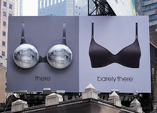
I love this advertisement. It is simple, cute, and to the point. I like the whole "headlights" theme. Women's breasts have often been referred to as their headlights and they play on this saying and made their advertisement off of it. I like how they placed it during the night to emphasize this point. As creative as this ad is, I had a hard time figuring out the brand. The brand is barely there which it says clearly, however, I did not know this brand existed upon viewing this advertisement. I thought it was a brilliant idea with good intent, however, missed the selling point. I think they maybe should have put a logo or something on it to brand it better. Great ad overall though.
TM Advertising- Redhook
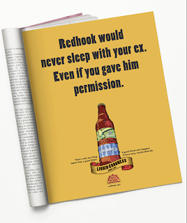
This advertisement is clever and funny. However, it limits its audience to just men by using the word "he." I believe this advertisement has creative copy. It appeals to the audience it is trying to, young adult men. Children would not understand this advertisement. However, a child could ask their parents what it means which then would maybe cause an uncomfortable discussion. I had a very difficult time finding TM advertising work on their website. I wasn't so impressed with this company's work. This ad in particular creates a relationship-based connection with the product. It relates the beer to a good friend. Overall, liked the advertisement, but was not impressed by the agency or the accessibility to their work.
Friday, February 26, 2010
Grey- Anne French Hair Remover

What? Completely missed the target. This print ad is supposed to show a hair removal product. I understand the retouched skin and what they are trying to say. But if you just look at it quickly you have no idea what it is for. It has very small copy which you have to look for. They use a beautiful model which when you look at the ad since everything else is burred you look straight at her face which is not being advertised. They used a stereotypical model who is thin, beautiful and not the typical American. Her leg position is very awkward and makes looking at her awkward. Advertisement missed the target.
JWT- Thrifty
Hilarious. This advertisement gets the point across in a very humorous way. Everyone knows the 16 year old hype of getting a car. Classically done. It keeps your attention and smiling the whole ad. The girls screaming is so over the top but definitely captures the moment. It has simple copy that is sweet short, and to the point. Very well done advertisement.
Y&R Colgate
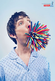
Y&R is a very creative agency. As I was looking through their work there were a lot of "what the heck" thoughts going through my head. This advertisement is a print ad that is done very uniquely. when first looking at it I thought to myself, what? But then the consumer sees the Colgate logo and recognizes those objects in his mouth are toothbrushes and that it is the power of that many toothbrushes that Colgate has. The color scheme is very appealing and makes you want to look at the ad and figure it out. The angle it was taken at is an excellent angle that gives the full effect. The models expression is priceless and fits the advertisement very well. I thought this ad used great colors and a great model.
Saturday, February 20, 2010
Ogilvy & Mather- Dove Democracy
This commercial is kind of ironic. They are advertising that men should feel comfortable in your own skin, however, the men they use in the advertisement are all good looking men. They are not the average joe shmoe. They are all under the average weight and the very last man they show is a good looking, older gentleman. I think it is excellent that they are advertising a good cause but I do not think they accurately portray the general public. I like the setting they use for the most part. However, I thought the part in the bathtub was kind of creepy. Overall, good topic and thought process, but slightly missed the target of advertising to the average american.
Martin/Williams- Payless Easter
This advertisement is very uplifting. It leaves you smiling. It reminded me a lot of my family when I was little. The music was a fantastic choice. The way the portray the shoes and the family during Easter was done very well. The angles in which the advertisement was shot was done excellently. Very well put together and got the point across. This is very similar to a lot of Martin/Williams other work. Crafted beautifully and left consumer feeling happy.
Wednesday, February 17, 2010
Latin Works- Bud Light
This advertisement reflects the agency by showing many different ethnic groups. Latin works is known for its, well latin work. This advertisement is somewhat stereotypical which could offend some of the consumers. It brings humor and gets to the point. "Always worth it." On of my favorite parts is at the very end when they are perfecting the way he says "bud light." One question raised is, what ethnicities are being portrayed? Overall, this advertisement is funny, and gets to the point. Bud light is advertised throughout the entire thing so you know what the product is within the first few seconds.
Dieste Harmel & Partners - Clorox
Dieste Harmel & Partners is primarily a latin based advertising agency. This advertisement incorporates the imagination of a little kid and the way kids see "problems." The child is speaking spanish but the copy is in english. The cartoon does an excellent job in capturing the little boys imagination and how he perceives the situation. His response to his mom is so innocent. This advertisement does an excellent job of portraying the childish innocence. Clorox really isn't in the advertisement until the very end. The target audience is also an interesting choice. It is appealing to children with the cartoons yet children aren't the ones buying the product. They took a unique approach on selling bleach. Typically a mother or dirty house is seen but this time they soley relied on the little boy.
Monday, February 15, 2010
GSD&M/ idea city- Kohler toilet
This advertisement is typical of the company. A lot of the advertisements that GSD&m/idea city do they don't explicitly advertise the company until the very end. Many times you watch one of their ads and do not know what it is for until the last 5 seconds. This is an interesting product they chose for this company. Many consumers relate Kohler to more kitchen appliances than their toilets. The idea was very funny. The objects he finds to put in the toilet brought humor to this spot. The wife walks in as he is pouring dog food in a toilet is priceless. Who has dog food even remotely close to a toilet? The hot plumber girl was a great touch. It broke a part from the traditional male plumber with his butt crack showing. It portrayed women in the service industry. Not only was it a woman, but a very well put together one. Something you don't typically see. This advertisement was crafted very well. The music was also well chosen. Gave you a sense of urgency like the advertisement.
Weiden & Kennedy
play="true" loop="false" quality="high" allowFullScreen="true" allowScriptAccess="always" flashVars="config=http://creativity-online.com/xml/config.player.php&p=19851" type="application/x-shockwave-flash" pluginspage="http://www.adobe.com/go/getflashplayer">
Weiden and Kennedy recently released this advertisement. It embodies all that W&K is. It is innovative and appeals to your inner senses. At first one might wonder what they are talking about. How do the social issues around the world not matter? They use world vices to emphasize unity.
180 Amsertdam- Adidas
This advertisement features Johnah Lomu coming to the rescue of a fish. In the beginning when you are watching it you are thinking to yourself, what is this advertisement for? I first thought it had to do something with saving the environment or ocean because the first copy states the elevation of the city. Then all of a sudden you see Johnah come running up in decked out adidas gear. As he is dodging toward the ocean they pause it for a second to show the adidas shoes and socks. There are a lot of product placements throughout this advertisement. He performs out of the ordinary events such as running through a car wash and is fully in shape. Then at the end of the advertisement the elderly man says, "adidas makes you more caring about fish... and even people." This proposes that Adidas makes you better all-around as a person. This advertisement gives Adidas associative power with endorsers. They use Johnah to show the power Adidas could have.
Friday, February 12, 2010
Advertising, a work of art.
http://www.de.ddb.com/public/en/whatwedo/work/thueringen
This advertisement was done by DDB advertising agency. It is art which creatively uses technology and a mp3 player to advertise for sausages. It represents how the sausage is so good that it brings music to his ears. At first one may think that it is an advertisement for something else but as you analyze it you see it's the sausage that brings the most harmonious tune.
http://www.de.ddb.com/public/en/whatwedo/work/volkswagen_new_beetle_cabriolet
This advertisement was done by DDB advertising agency. When one first looks at it they are in awe of natural beauty. It in no way shows or hints that a car is what they are advertising. As one looks at the bottom they see that it is actually an advertisement of the Volkswagen new beetle cabriolet. It just simply shows that this car is a new, rare, natural beauty. Without many words, it shows off this new masterpiece.
http://www.martinwilliams.com/#/work/non-traditional/Not_For_Sale/Receipt_Amy
This advertising was done by Martin Williams. It creatively uses a receipt of a purchase, something we see every day and don't think much about to show that in life some things really are not for sale such as this young girls body. It is an advertisement to bring awareness that people are abducted and used everyday. This advertisement is art in the fact that it uses something so simple to bring up a very serious issue.
Monday, February 8, 2010
3 Best and 3 Worst Super Bowl XLIV Advertisements
3 Best Advertisements
Snickers: Your are not you when you are hungry
This advertisement was probably the best one. It incorporates humor and celebrities. The line really accentuates the humor of how a snickers bar will turn from an old lady to a macho man. It is creative, funny and shows the power of snickers.
Doritos
Another great advertisement. Shows how a "man's best friend" will turn against him for a bag of doritos. The shock collar makes this advertisement really funny and entertaining.
Denny's
One of the most creative and funny. I believe this advertisement may have one of the bst outcomes. I think there money was well spent. The chickens were a great effect that added humor and originality.
3 Worst Advertisements
Dr. Pepper
I really disliked the little kiss band. I thought this was a terrible advertisement and a waste of money. It my get the name in your head, but overall terrible put together advertisement.
Go Daddy
It was kind of funny how they were trying to poke fun at themselves from previous advertisements, but still was not funny and because it wasn't a scandal like the past it really didn't impact anyone. They didn't describe their product at all, the viewer is still wondering what GoDaddy even is. Some may go log on just to find out but most probably won't because the advertisement was terrible and did not intrigue anyone.
U.S. Census
What was this advertisement even about? This just left me confused. They didn't give us the date or where. Yes, they questioned us about it, but then gave us no answer? Weird and terrible.
Sunday, February 7, 2010
Goodby, Silverstein & Partners- Got milk?
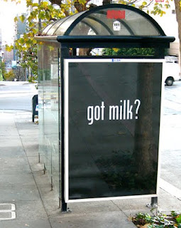
Goodby, Silverstein & Partners is well known for appealing to all your senses. We all know the Got milk campaign and how popular it is. It was developed nearly 10 years ago and is still going strong. So what made this popular? It's simple and got to the point. This advertisement was posted in San Francisco's bus shelters. What made it so appealing? It gave off cookie scented air. When one was in the bus shelter they smelled freshly baked cookies. When you smell cookies, what does one think of? Got Milk? This was highly creative. It only cost 15,000 dollars and received over 59 million dollars in media. It only lasted one day when it was forced to be taken down. When this occurred, it received even more media. Goodby, Silverstein and Partners does an excellent job at thinking outside the box and appealing to the emotions and senses of the consumer. This scent brought many consumers a sense of home, the smell of their own mothers freshly baked cookies. Similarly, they produced an advertisement for ebay in which they showed a kid playing with a rubber ducky and later in life he found it on ebay. Again making the consumer connect with the advertisement and making them think about their own life. This simple advertisement was innovative and successful. Very well done.
Thursday, February 4, 2010
TBWA- Pedigree, Dogs rule campaign
TBWA is known for creative campaigns that last. This campaign does an excellent job at appealing to your emotions. Even if you are not a dog lover, this campaign gets to you. The first one doesn't even have any script, the only thing you hear is the slow music. This campaign was more than just commercials. It was a print ad, and then TBWA even went above and beyond and opened up a shop where they sold apparel and had a park with actual dogs for adoption and a place where you could adopt them. The created a commercial for Taxi companies. They really took this campaign to an extent that really paid off. They put up posters in Times Square. This campaign took off in a big way. Pedigree turned into not just a dog food product, but to really caring about dogs. The campaign itself almost makes you want to buy a dog even if you don't want one. While watching the ads I felt like I should go adopt 5 dogs. It gave options too. You didn't necessarily ahve to buy the dog, but you could donate online and they would match your donation. They showed the true aspect that dogs are a part of your family. They made you think of how you would feel if your family abandoned you. This campaign truly does encompass everything of a great, successful campaign. It really does get you to think and appeals to your emotion. The lighting they use, the flashbacks, the slow music, the limited copy, all if it contributes to a a great overall effect of sympathy and empathy for the dogs.
Tuesday, February 2, 2010
DDB- Fun Theory
The Fun theory!
Volkswagen asked DDB to produce a campaign to show new technology without comprising the cars ability. To show this they developed the fun campaign. This is an innovative way to inform the public of the importance of being eco-friendly without having to give up anything. It helped promote social awareness and the importance of being eco-friendly. Volkswagen not once is mentioned in the advertisement, nor is there any car in it. It simply showed, how taking the stairs instead of the escalator (promoting health) or throwing away your bottles (encourage correct disposal) or throwing away your trash in the first place is not only fun but smart. They show you can do good for your environment while having more fun than you would by be ing lazy. This is a very innovative campaign that DDB created for Volkswagen. Without even mentioning the product they had buzz all over the media and had people swarming their website. This is a reflection of how DDB as a company loves helping the world. The agency produces a lot of work to promote awareness. The fun theory campaign was a great way to show consumers that fun doesn't mean compromise.
Saturday, January 30, 2010
BBDO- Snickers- Tag
This BBDO advertisement is typical for the company. It incorporates humor into something so simple. It takes these huge indestructible objects and causes a huge ruckus, breaking cars, and running around, while mimicking a little kid game, tag. It then transforms that kid fun into a young man then back to the indestructible creatures. It not once mentions the product but instead shows the effects of what you will feel when you eat one.
Thursday, January 28, 2010
Advertising, a work of art.

Very well done. Creative. Saatchi and Saatchi did an excellent job of advertising their jeans. Different than any other advertisement. They didn't use sex appeal or even exemplify how their jeans are used. This is simply art and done very well. Shows their creativity and thinking outside of the box.
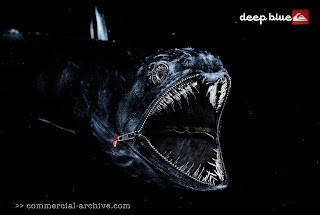
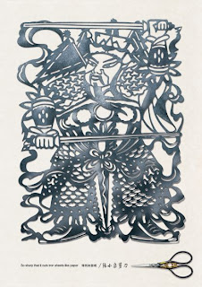
Shows the precision of the scissors in a very innovative way. Very creative. It is very obviously artistic. Shows a new way to advertise scissors. Loved this ad!
Half real half cartoon! Very innovative. Loved the colors, very captivating. The advertisement of classic Ray Bans could not have been better. Loved the use of the copy "never hide." This ad couldn't hide even if it wanted to. It stands out like no other advertisement I have ever seen. Great advertisement!
Subscribe to:
Comments (Atom)
