Wednesday, April 28, 2010
BBH- Sprite Slam Dunk
Simply Beautiful. The mix of two arts. Poetry and rapping while describing another talent, dunking. I like how they used a real person and depicted average people and did not use celebrity endorsements. It was real, simple, and beautiful. The words are exceptional and well crafted. The setting of starting off in the library added to the effect of scholarship. The black and white effect added to the dramatization of the basket ball court. You only see Sprite shown once in the very beginning. The juxtaposition of poetry and sports was done beautifully. Typically one would not put basketball and poetry together but this was very well executed and the audience was captivated the whole time. Simply beautiful.
3 coming together advertisement
This ad starts with parts of the car coming together. It is visually enticing and different from most other car commercials which usually depict cars driving fast. It shows different the parts of the car while using an excellent choice in background sounds. The music at the end is very exciting. The tag line "isn't it nice when things just work," was very creative and goes well with the advertisement. Very well done.
Great advertisement. In a time when the world was separated coke took advantage of this and used their product to bring everyone together showing that everyone had something in common. All the people come together to enjoy a classic product. Great advertisement with great filming and angles. Really showed different people from different countries really coming together.
Great ad that shows how a coke is made. Creative and innovative. Different from any other beverage commercial. Shows the creativity and graphics W+K is capable of. Loved the ad and the happy music in the background. Appealing to all ages.
Tuesday, April 27, 2010
Weiden & Kennedy- Dante's Inferno
"Hell awaits?" Inappropriate. This advertisement had excellent graphics and was a good idea, however the tag line at the end was completely not necessary. Even though it is rated as a mature game, children can still see the advertisements for it. The portrayal of the woman in the beginning is completely stereotypical. Her low cut top and seductive outfit is what gets the man. Then he of course chases her. The music was an excellent choice, it describes the situation perfectly. Well executed advertisement, however the tag line completely ruined it. The use of graphics will entice children's interest in watching it and may cause problems with their parents as they beg to have it. Well-done but inappropriate ending.
Dentsu 5- iPhone
This commercial was very easy to understand universally which I believe makes it a great advertisement. Even though it is done in Japanese, even without reading the subtitles I could understand the message. The music put you in a relaxed calm mood while keeping the audience's attention. Overall, very sweet advertisement that got its message across in a creative way. They focused on one application of the phone and did not try to go overboard with it. The night time setting definitely added to the dreamy atmosphere. The dog was a cute cliche added. When in doubt, use an animal to portray sweetness. A bit of a cliche, but cute. The shooting star was another cute cliche. Full of cliches but overall well done and universally understood.
Monday, April 26, 2010
3 unethical ads

Is this a joke? Terribly misleading. This diet is NOT a diet. Can easily mislead consumers who don't read the copy. Insults the consumer's intelligence by making them think they can lose weight on fast food. Sitting in the car makes you even lazier. This is a ridiculous advertisement.
Are you serious? DDB really is trying to make shock value out of 9/11? One of America's most tragic days and they are trying to make an advertisement out of it? This is one of the saddest most inappropriate ads. I am speechless. Having a bunch of planes flying towards the twin towers should never be produced. The dim lighting ads the effect of the sadness of this day. It is completely insensitive.

Advertising tobacco is now thankfully illegal. Something that kills 1200 people a day is socially irresponsible. Advertising that the taste is good entices people to want to smoke more which is just terrible all around. The cowboy is sexually enduring which only seduces woman to smoke more and men to aspire to be them.
3 Ethical Advertisements

Amazing advertisement. Definitely shows how advertisers have the ability to make models so unrealisitc. Shows society models are photoshopped to the extreme that they don't look like themselves. Demonstrates how we, normal people, should not feel so insecure about our appearances and not compare ourselves to unrealistic models. Great campaign that helps people feel better about themselves.
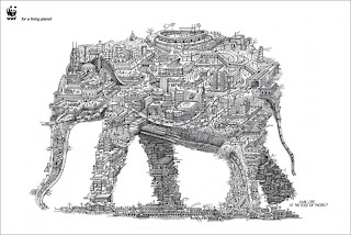
I like the tag line "our life at the cost of theirs." It shows how us humans are being selfish in the face we continue to build on wild life's homes. The shape of the elephant is very creative and clearly gets the point across. The black and white image adds to the dramatization of this advertisement. Great ad that gets people thinking.
Great campaign! I like how they challenge them to take a day off. When all 1200 people come together and collapse you can really see the impact tobacco has everyday on people and their families. This campaign was very impactful and definitely had people talking long after it was released.
Saturday, April 17, 2010
Cliff Freeman & Partners- Little Ceasers
Cliff Freeman & Partners recently shut their doors. Although they no longer exist, they did leave some memorable campaigns and work behind that will never be forgotten. Love them or hate them, they will forever be engrained in your head. "Pizza, Pizza" for Little Caesars is amongst some of these unforgettable slogans. This advertisement is stupid and funny. They tried bringing humor the the simple fact that they now deliver. It is so stupid at times, you can't help nut laugh. The use of the mechanical dog was funny. The expression on the employees face throughout the advertisement is so intense. When the boss squeezes his face it reinforces the idea that the boss is completely in control over their employees and kind of degrades them as being lesser of a person. The different settings they put them in is creative, I like the part where he is closing the car door with his foot. This show that they have every detail down to perfection and don't forget to practice anything. The use of different races at the time made the advertisement that much more appealing and widened their audience.
Wednesday, April 14, 2010
VitroRobertson- New Castle

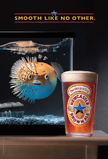
Creative. I like how they stepped out of the box of stereotypical beer advertisements. There is no one trying to look seductive and there is no party going on. This advertisement is simply advertising the best quality of the beer, the smoothness. I like how they used a blow fish, it was a very creative idea. No one would think to use a fish and beer in comparison to one another. The placement of the water and the bubbles was placed perfectly. On the "smooth" side the blow fish is breathing more freely as we can see the bubbles rising on that side. On the not smooth side the bubbles are just sitting on top of the water reflecting difficulty to breathe by the fish. The way the glass is cut also reflects the smooth side as being cleanly cut while the not smooth side is a bit more rigidly. The only thing I would of changed is I think they should have placed the treasure chest on the smooth side to symbolize smoothness is a treasure we must appreciate. Besides that, I really enjoy the thought of this advertisement and think they got the point across in a new, creative way.
Crispin Porter + Bogusky - Burger King
This advertisement caused a lot of controversy. Many associations affiliated with mentally handicapped people were outraged. The words, "insane, "crazy," and "mad," all imply the king being mentally handicapped. He is being chased by someone who is in an all-white coat which suggests a doctor uniform. They then continued to tackle him and help him gain control. This advertisement had good intentions and was funny until you realize the little details. Advertisers must think from all different angles. To some this advertisement was funny, to others it was offensive. Good idea, offensive portrayal.
Tuesday, April 13, 2010
McKinney- Nike
Beat the B.S.- STEREOTYPES to the maximum. The point in this advertisement is to break the stereotypes, inequalities, and stupidity that people still believe. I like the point in the advertisement but it is way too long. It very creatively crafted and the different images keep you wondering. Some of the things they say are kind of shocking. If a child saw this though it could put wrong ideas and maybe even put stereotypes in their heads that weren't there before which would have the opposite effect. They don't get to the point quick enough, it is like a tutorial. I would have turned off the advertisement before I saw that it was for Nike and was actually going against these stereotypes. Great idea, but did not keep the consumer intrigued.
Saturday, April 10, 2010
Team One- Boost Mobile
Hilarious and creative. I like the use of the older generation to exhibit something for young people. When I first saw this I had no idea what it was for, but then after it made so much more sense. I like her dancing at the end and showing the older people freak. The tag line "but its just more fun showing old people, phones just got fun," really captured the essence of the ad. I like how it completely got away from traditional advertising for phones and didn't show anything else about the fun except for the fact that its fun. The language and dance moves they were doing throughout was hilarious. Over-exaggerated the point but successfully did it. The use of language was perfect for the actress' part. Well done.
Euro RSCG- Nikon

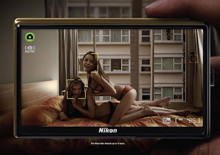
Provocative. This advertisement is very suggestive. When I first looked at it, I did not understand the point. Completely missed the point. After looking at it and analyzing it I saw the man in the background creeping. The auto-focus is the feature being advertised. The advertisement is very stereotypical, slightly inappropriate and creepy, and did not do a good job and prevailing the whole point. I did not like this ad and thought it was just slimy and inappropriate. Why is there girl and girl action with a guy creepily watching? If a kid saw this, what would they think? This advertisement took a while to understand and did not convey an explicit message.
Arnold Worldwide- Tyson
Priceless. We all know kids are the pickiest eaters. The answers are real, you can tell there is no script and no forced answers. I really liked this advertisement. It's honest, funny, and gets the point across. I didn't exactly like the end when the boy says "to be honest i don't really like... then cuts into introducing the product." I know what they were trying to get across but if you were just listening you may think that the kid doesn't like it at first until they continue with the dialogue. The white background they used as the kids were talking emphasized the innocence and purity. The mispronunciation of the words also showed the innocence of the children. I really liked the little boys face who without words expressed his exact feelings. To kids what something looks like is very important, it had nothing to do with the girl not liking spaghetti but rather the appearance. Its a good way to market chicken and healthy food to kids. I liked the diversity that they used. They used children of many different races making it universal. The end when they say "thanks mom" also markets to the mothers suggesting they should serve their kids Tyson's chicken. The line when the girl asks for more shows how much they really do like it.
Saturday, April 3, 2010
Kaplan Thaler Group- Trojan
I really thought this ad was creative. They wanted to raise awareness which they sure did from the controversy of it. They got a ton of media over it. The pigs were a very clever idea. No one wants to pick up a pig. It was a bit of a cliche with the beautiful women seeking to meet a man at the bar to go home with later. But the overall idea was very creative. The song went perfectly with the advertisement. No need for pigs to fly when you can just get a condom and no longer be a pig. The angles the used when the pig was walking toward the bathroom to get a condom was great, kind of cliche but got the point across. They used a women's thin legs as he was approaching the condom box. This agency has some very creative campaigns. They may have overused the pig a little bit considering there was not one "nice guy" until that one got the condom but I think that just engrained the idea even more. A little over exaggerated but overall great ad.
Fallon- Sony
Creative, amazing, innovative. Loved this commercial. The use of the bunnies transforming into other things was an awesome idea. How you go from lcd screen to play-do to advertise for it is brilliant. I especially liked the part where the whale turns into a bunny. The colors and use of colors was fantastic. At first when I viewed this advertisement I had no idea what it was about, but at the end it all made sense. The fan of waiving colors drove the message home. The different camera angles and scenery really exemplified the use of colors and all the different ways you can view a single object. Different than any other TV ad I have ever seen. Very innovative and different.
Leo Burnett- Amnesty International
This ad is powerful. It brings to the attention an issue that is so very real that so many people do not want to talk about. I like how they ended it with the innocence of a little girl. The footage that showed was so real and raw. It made you think twice about the ad and you couldn't help but feel sympathy for the victims of abuse. They showed many different issues but all dealing with human rights. The copy that went with it really helped push the point. This advertisement was informative and kept your attention the whole time. The facial expressions of the victims and their screeching screams and pleas for help are so hard to listen to. Its so real and so powerful. The background music helped add the dramatization of the advertisement.
Saatchi& Saatchi- Prius
Beautifully done. This animation based commercial incorporated everything it was hoping to. It showed the power of green and stated the lower emission as the car was driving through the town turning everything back to green. It had the great, simple tag line "its harmony between man, nature, and machine."It showed the interior of the car and the hills it could still climb. Creative and was not your typical car ad with some hot girl selling the product. Made on a need-base mind frame. Very practical advertisement that truly was just selling the product, nothing more nothing less.
Subscribe to:
Comments (Atom)