Monday, May 3, 2010
Droga 5- Puma L.I.F.T
Innovative. Creative. Captivating. Loved this ad! Appealing to all audiences. The graphics used and the background music went beautifully. The graphics of the flowers being in the sky and the man kneeling down to give her flowers was executed so well. This entire advertisement had the "wow" factor.
Mother- Neurofen
Creative. I had to watch it again to get the full effect, but I liked this add. It was very creative and showed how it works in a captivating way. It kept your attention all the way through while demonstrating it in a simple way. I like how they put the "problem" bird in black with a white background. They used a crow looking bird. Crows are a bird most people find as pest. It's simple voice over is straight to the point. I like the animation of how it lasers the problem to make it all better. Great animations and sounds. The knocking is an annoying sound that many people feel when they have a headache. Simple and to the point. Great advertisement.
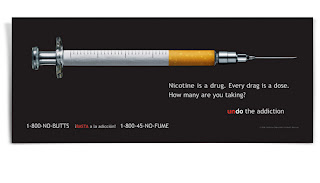
Wongdoody- CA department of health

Cringe. I hate needles, love this advertisement. No need for words. This picture is excellent. Although not necessary, the copy is perfect. Everyone knows smoking is bad but people often don't consider it a drug. Reality is nicotine is a drug. The number 1-800-no butts is funny. It is to the point that there is no excuses for smoking while giving motivation. It gives motivation by reminding the target audience that there really is no excuse for smoking. It hits the audience in a very true, dynamic way. The cigarette portrayed as a needle was done beautifully. It has every last detail even down the the lines of the dosage on the cigarette. It makes the target audience think about their actions. Very powerful and well done.
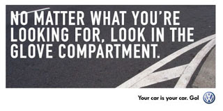
La Communidad: Volkswagen


Real. I like this campaign. It is very relatable to the customer. I picked these two because they are very true about my life. I keep everything in my glovebox and am always scrambling to find things in there. A lot of my friends love their car more than they love anything. Especially boys, I have learned do not let anyone drive their cars. In high school if one of our friends drove a guys car it was a huge deal. Its the simple, little things that make this campaign great. It does not advertise the cars or the obnoxious labels of car, but instead focuses on the little truths of life. When looking at this campaign I could not help by laugh because it is so true. I think it missed the mark of selling its brand name, but was definitely creative. The simple white text on pavement, kept it short and sweet. There were no distractions. Just simple copy made to make you smile to yourself.
David&Goliath- Kia Soul
Loved it! Very creative. Although it used the cliche of using animals, it was very creative. I like how the use of the wheels. The part where the mouse was on the train tracks going no where but there was a train coming was funny and left you with the question of "what is coming next?" The copy of a new way to roll worked amazing with this advertisement. The used a very creative idea and made the advertisement really cute while advertising the features of the car. It showed the use of the mp3 and the sleek look of the car while keeping the audience engaged. I like the upbeat music. The lyrics of the song went really well with the movement of the car. The end where it advertised the features and price was short, sweet, and to the point. Great creative idea and got the point across clearly. Very well done.
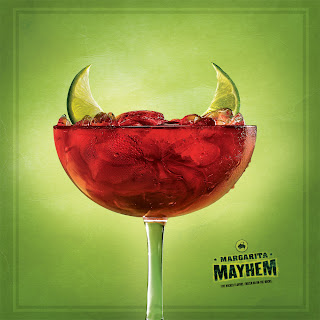
22squared- Margarita Mayem

Love it. Great depiction of a margarita. Margarita as a devil? Evil depiction or accurate? The debate will never be settled. Some love them, some hate them. We've all heard the stories of tequila and no matter what people agree margarita's will have some sort of effect on you. The devil depiction shows a playful side of alcohol. It shows the danger you could get in yet uses the bright colors to depict the fun, playful side. The colors make you want to have one. The vivid background adds to the actual picture. I like how they used the limes for the horns. Very creative way to market margaritas. Evil and fun turned into one great advertisement for alcohol. Different from other depictions and great way to market a tequila based drink.
Sunday, May 2, 2010
TAXI- Parkinson

Well done. This advertisement is captivating. At first one may think to themselves, "where are all these hands coming from?" Then you read the copy "everything is harder when your body turns against you," and you begin to even wonder more. It's not until you read the Parkinson's logo until you get it. The hands are very powerful in the fact that they captivate the moment of how he is trying his hardest to get up and yet no matter how hard he tries there is always something holding him down. Many people don't stop and think about how hard it really is for people to live with parkinson's. I think this advertisement did a very good job and portraying the day to day hardships. This advertisement was only one part of a whole campaign. The campaign showed a variety of different people doing a variety of different day to day activities. Simple and to the point. Even though its a print advertisement it did a very good job at getting the message across.
Subscribe to:
Comments (Atom)