Sunday, March 28, 2010
Publicis-Flemish Milk Board
This advertisement was sweet, funny and creative. I like how they set the commercial with the elder couple slow dancing. The kids dancing were hilarious. This advertisement can appeal to a lot of different audience groups. It can appeal to the parents to help persuade their kids. It also can appeal to the children because it gives them a one on one example. As I was growing up my mom always told me to drink my milk so I can grow up strong. This gives that message in a creative, cute way. Great choice in music and settings. I like how they decorated the rooms, it added to the message.
T.A.G/ 215
Monday, March 22, 2010
Campbell Mithun- United Way

Different and memorable. Good job at standing out. However, I don't know if everyone who walked past this understood the message. I like how they broke away from the typical stereotype of how advertisements usually portray poverty. They used an average woman who actually looks somewhat happy to be holding the signs. I think they needed another sign to explain the ads. Many people probably just walked by and didn't even give it a second glance. Good idea, but may have missed the point.
Sunday, March 21, 2010
Hill Holiday- Novartis
I enjoyed this video. It gets the point across. I think it could have been cut down.. it was kind of lengthy and towards the end was wondering what the point in the ad was. The use of the little girl represented innocence and really added the the affect. The smoke was a cool effect that exaggerated the idea. Many don't think that high blood pressure is a very serious problem and is kind of just normal, but we really do need to educate people about it as it is a serious health problem. I really like how they showed many different types of people in different settings it expressed the diversity and the fact it could happen to any adult.
Mullen- National Grid
Excellent campaign. Innocent, sweet, powerful. The background music fit the advertisement perfectly. The use of the little kid added extra effect. The scene where they jump in the pool/ the polar bears natural environment was heartwarming. The interactive aspect of the campaign adds a great strength to this advertisement. The one on one involvement makes it personal. It involves the audience and helps educate the public of how they can help. This campaign is global warming prevention and how to preserve energy. The day to day activities you can do to help the environment can be taught simply by becoming friends with Floe, the polar bear. This ad incorporates the consumer and the company while making a positive change in the community and on the bigger picture, the world. This is a great campaign that is executed beautifully.
Deutsch- Coors Light
Typical, typical, typical. Creative tag line? Yes. Humorous because it's funny and everyone has felt that way at one point. The song is funny and captures the mood of the wingman. The facial expression of the two at the table is priceless. She not only is only talking about herself, but looks like she could knock someone out. I like how they showed their beer in two different situations. One they suggest alcohol will give you the best time of your life and they completely used the cliche of the girl dancing out of control because of the beer. And I like how they showed the product also with the guy who is downing his sorrow with his beer. The dim lighting also sets the mood excellently. The man's face of complete and utter boredness and then he cheers' to his dacning friend is classic. "Taking one for the team, so your buddy can live the dream." Classic.
Monday, March 8, 2010
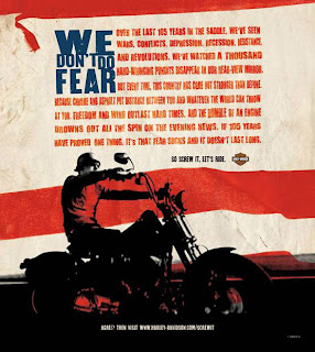
Carmichael Lynch- Harley Davidson

One of Carmichael Lynch's main clients is Harley Davidson. This advertisement reflects society at that point in time and appeals to Americans of that time. The copy is kind of lengthy but very appropriate. It leaves the audience with a feeling of empowerment and dominance, something lacking in many peoples lives. It gives a sense of control which many need in their lives. Harley Davidson is something that almost all American's recognize as being a classic. The use of the American flag in the background adds to the overall dynamic impression of this ad. The ending line "screw it, lets ride," is short, empowering, and strong. Great advertisement appealing to America's emotions and times of distress. Very well done.
Lowe Worldwide- Axe Effect

So typical. Axe has always been a provocative company advertising women's bodies more than the product. It shows the unrealistic results of what would happen if someone used axe. The visual of the woman cooking in that outfit is outrageous. It is very stereotypical in the sense that woman should be cooking and fantasy based on what she is wearing. Why is she on her knees? This is very suggestive of something else that is absolutely not appropriate. What if a kid saw this ad? Her dresses slit is high enough that if it moved over any more her butt would be showing. This advertisement goes for the shock factor that is completely inappropriate. Targets the correct audience but in a complete inappropriate way.
Draftfcb- Miller Lite
Love the taste of your beer campaign. Hilarious and very well done. Draftfcb played off the fact that a lot of men don't really enjoy the taste of beer but just drink it to be manly. The ending lines after they say they love their Miller lite is classic. The use of the dog and the dogs expression is very creative. The gentleman would choose the girlfriend over the "mans best friend" but would not over his beer. This advertisement was very obviously targetted at young men and used the typical "hot girlfriend" for the mode. Although funny, was a very generic beer advertisement. Didn't take that extra "step out of the box" effect. Predictable.
Tuesday, March 2, 2010
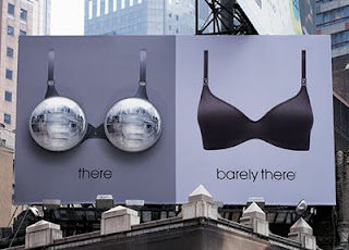
Martin Agency- Barely There

I love this advertisement. It is simple, cute, and to the point. I like the whole "headlights" theme. Women's breasts have often been referred to as their headlights and they play on this saying and made their advertisement off of it. I like how they placed it during the night to emphasize this point. As creative as this ad is, I had a hard time figuring out the brand. The brand is barely there which it says clearly, however, I did not know this brand existed upon viewing this advertisement. I thought it was a brilliant idea with good intent, however, missed the selling point. I think they maybe should have put a logo or something on it to brand it better. Great ad overall though.
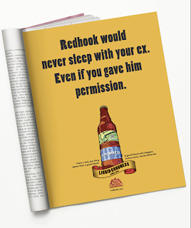
TM Advertising- Redhook

This advertisement is clever and funny. However, it limits its audience to just men by using the word "he." I believe this advertisement has creative copy. It appeals to the audience it is trying to, young adult men. Children would not understand this advertisement. However, a child could ask their parents what it means which then would maybe cause an uncomfortable discussion. I had a very difficult time finding TM advertising work on their website. I wasn't so impressed with this company's work. This ad in particular creates a relationship-based connection with the product. It relates the beer to a good friend. Overall, liked the advertisement, but was not impressed by the agency or the accessibility to their work.
Subscribe to:
Comments (Atom)
